As a PROP365 trader using TradeLocker, selecting the right chart style is a key aspect of refining your trading strategy.
Which charts does TradeLocker support
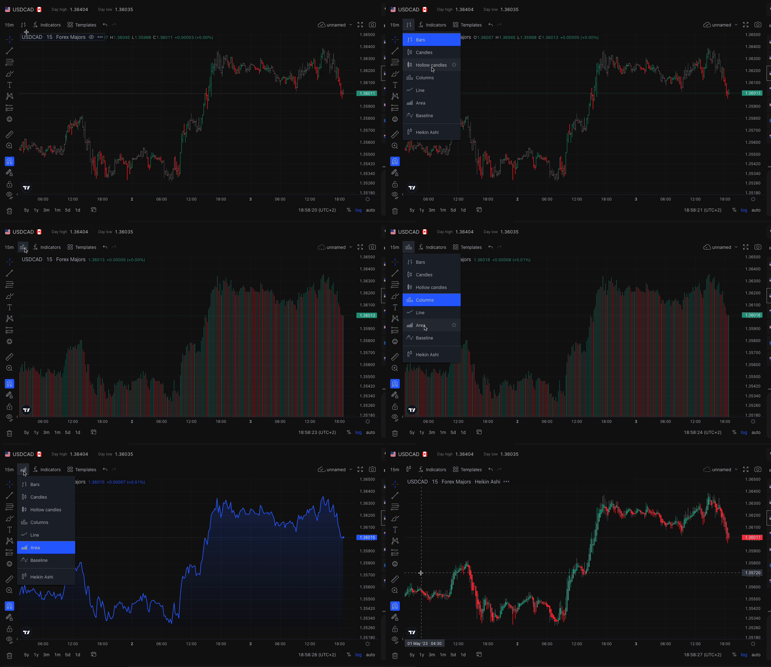
You can easily change your chart style in TradeLocker to suit your preferences and trading needs. The platform supports the following chart styles:
- Bars
- Candles
- Hollow candles
- Columns
- Line
- Area
- Baseline
- Heikin Ashi
Press the chart icon
Just click on the style icon above the chart in the left corner next to the Indicators, and choose your preferred style.
Stylize your chart
If you want, you can add more changes to your charts. Just right click anywhere on the chart (or double tap if using your mobile phone), choose Settings and customise it using the menu.
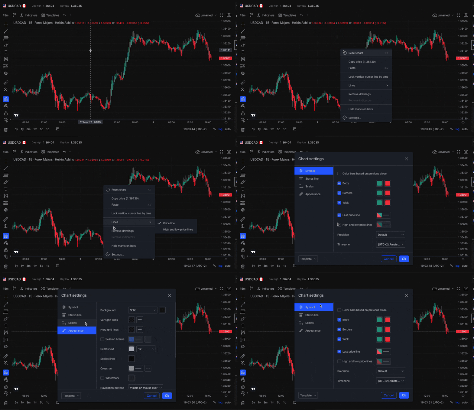
And that’s it! You can also share your charts after you’re done customizing. 🙂
How to change the chart style on mobile
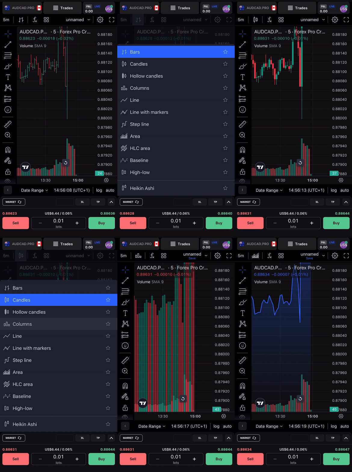
Tap the chart syle icon in the upper left corner of the screen. A pop-up will appear where you’ll be able to select the desired chart style.
How chart style affects your analysis
The chart style you choose significantly influences your market analysis and, ultimately, your trading decisions. Here's how each style can be used to enhance your trading on TradeLocker with PROP365 Account:
Bars
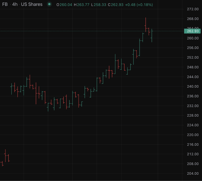
Bar charts display the open, close, high, and low prices within a specific time interval. Ideal for technical analysis, they help PROP365 traders spot trends and key support or resistance levels.
Candles
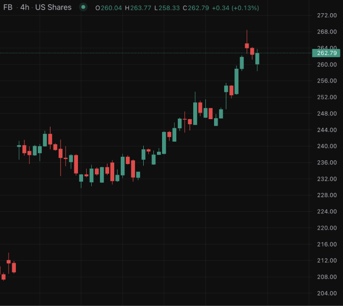
Candlestick charts offer a clear view of price movements, with color-coding to distinguish between bullish and bearish trends. These charts are perfect for analyzing market sentiment and spotting key price patterns.
Hollow Candles
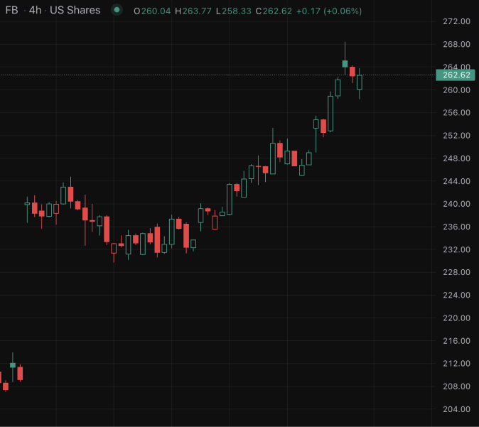
Hollow candlestick charts make bullish candles hollow and bearish candles solid. This style provides a clean visual representation of market trends, helping traders on PROP365 spot trends quickly.
Columns
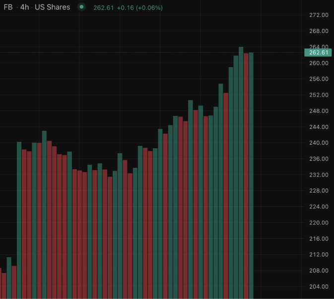
Column charts are useful for visualizing volume and other single-dimension data points. PROP365 traders can use these to identify high-activity periods and gauge market strength.
Line
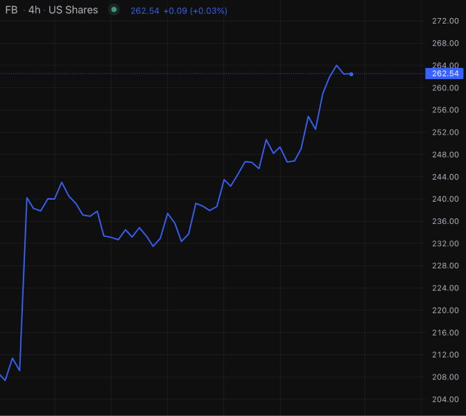
Line charts offer a simplified view of price movements, useful for tracking overall trends. They are perfect for traders who prefer long-term analysis on their PROP365 accounts.
Area
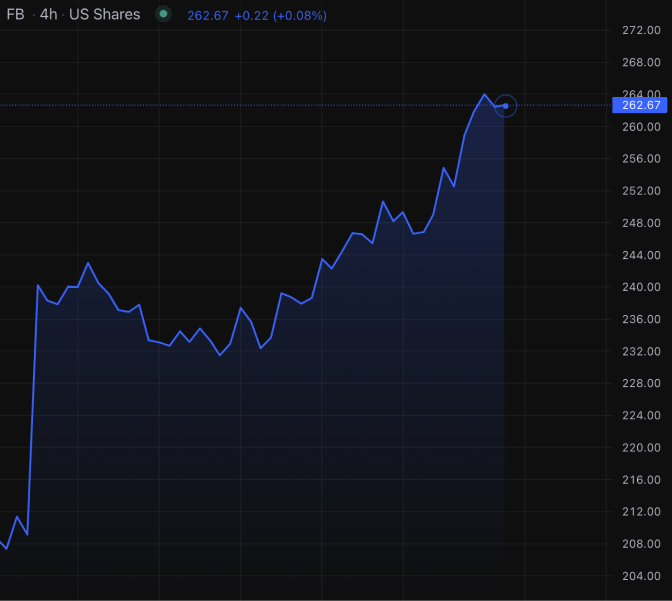
Area charts fill in the space below the line chart, providing insight into price and volume trends. This is beneficial for analyzing overall asset performance and market direction.
Baseline
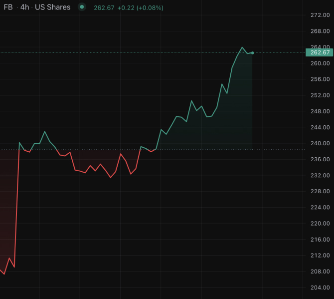
Baseline charts are great for comparing the performance of multiple assets by normalizing data. PROP365 traders use these for assessing relative performance in various market conditions.
Heikin Ashi

Heikin Ashi charts smooth price data, making it easier to identify trends and reversals. These charts are useful for minimizing noise and are particularly suited for traders using longer-term strategies in their PROP365 accounts.
Learn more here:
 Help Center